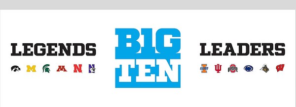
“If people don’t embrace it in the first hour, then maybe after 24-36 hours … or in a couple of years,” [Big 10 Commissioner Jim] Delany said. “Any time you have something new, it takes some getting used to.”
“Leaders and Legends? It sounds like one of those Narnia movies.” – Tony Kornheiser on Pardon The Interruption on Monday.
Listen, I agree the names are silly and bloated and silly, and I haven’t heard, read, or seen one person other than Delany who likes them.
I imagine a focus group or two allowed a little groupthink to decide this matter.
But I’m more interested in the outcry I’ve seen over the logo today.
Or, more correctly, I’m more interested there was an outcry over the logo. I felt the same way when the Internet popped a blood vessel over the Gap logo change and change back.
I understand design’s a language (or several languages), but I need help here:
I’m not necessarily sure how a logo (unless blatantly offensive) is a dealbreaker. I feel bad and dumb saying that – I know people who’ve charged upwards of thirty grand for a couple letters woven together.
If they can get it – if they can sell it – great! Enjoy a couple nice dinners and pay off a couple bills with that cash, but really – does someone go or not go to a college or buy a really peppy scarf because of the logo?
I’m only asking. I would love for a designer to tell me why a logo moves or doesn’t move the needle. Really – that’d be awesome. I will give you full measure of my attention, but I don’t need you to describe figure/ground or alignment or font style – I understand the basic elements of graphic design.
I would really love for you to tell me why a $30,000 logo might be better than a $100 logo.
I know I’m in a glass house here – as an occasionally professional copywriter, I can tell you why a professional copywriter can craft a compelling narrative that might make more people do stuff more easily than an amateur’s copy.
I want to hear the same from you. I’d love to hear the same from you. I will most certainly share your response with the leaders and legends who read this.

I’m with you on this one, Tim. While I understand that a bad logo can be poisonous, and that there’s a minimum bar for professional-looking logos that inspire confidence and trust, I’m just not sure that minimum bar is all that hard or expensive to reach. It’s certainly not out there at the $30K mark. Now, if you make billions, maybe $30K is peanuts and the incremental improvement from $500 to $30K is worth it.
And since you brought up the Gap logo, I couldn’t help of thinking about this quote from The Ad Contrarian: “…while I agree with critics that the new logo looks like something designed in Powerpoint, I think it would have had about the same effect on Gap’s sales as re-painting the men’s rooms.”
What’s incredible to me is that the same companies that will spend five and six figures for logos and visual brand style guides end up balking at spending four figures for a brand-voice style guide. You tell me, which is likely to have the greater impact: a new logo or communicating in a brand-aligned and 2010-appropriate voice?
I’m not a professional designer or copywriter, but that logo is awful. I wouldn’t buy a t-shirt with that logo on it. It’s awkward, unbalanced, and not visually pleasing. I could slap something together, even with the elements they already have, that would be more visually appealing, IMHO.